The Ask
This app is intended to assist people in caring for plants. It involves plant identification, plant care information, integrated plant care calendar, and a feature to diagnose and create a care routine for plants that are struggling with illness or other problems.
Design Process
Product Research
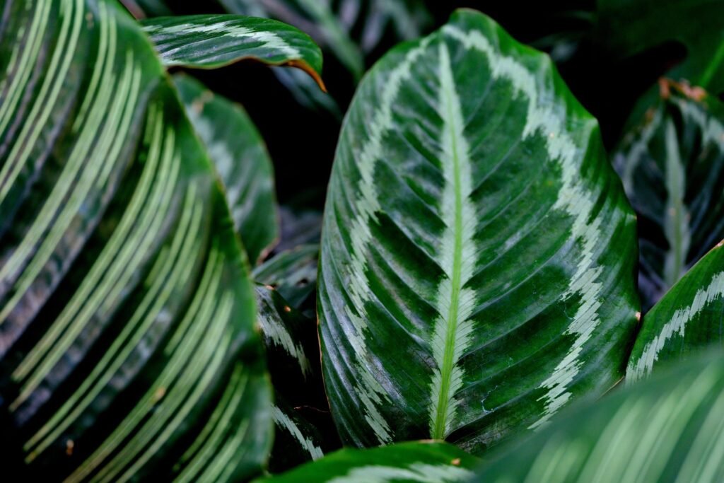
I don’t have many plants myself, so creating an app to help people take care of plants gave me good insight into what kinds of features might be helpful for people that are beginners in raising plants. My lack of knowledge was partially an asset while also being a drawback, but that didn’t stop me from diving into this project headfirst. I relied heavily on performing research to find what kinds of difficulties people often run into with raising plants, revealing some of the key pain points that an app like this could assist with.

UX Research
To assess initial interest in a plant care app and gather insights on desirable features, we conducted a user research survey with 86 participants. Of these, 57 identified as female, 25 as male, and 4 preferred not to say. All participants expressed interest in plant ownership, with 37 already actively caring for multiple plants. The sample included a wide age range: 12 participants were ages 12–17, 63 were between 18–64, and 11 were 65 or older.
A key insight from the research was that while enthusiasm for plant ownership was high, nearly all participants reported difficulty knowing how to properly care for their plants, particularly when plants began to show signs of distress. Many described frustration with vague or conflicting information found online. When asked about potential solutions, nearly every respondent expressed interest in a mobile app that could help identify plant species, provide care instructions, and diagnose problems based on symptoms.
These findings validate a strong market interest and clear pain points that a plant care app could directly address. The results also suggest an opportunity to build an app that not only educates, but reassures and empowers users across a broad range of ages and experience levels.
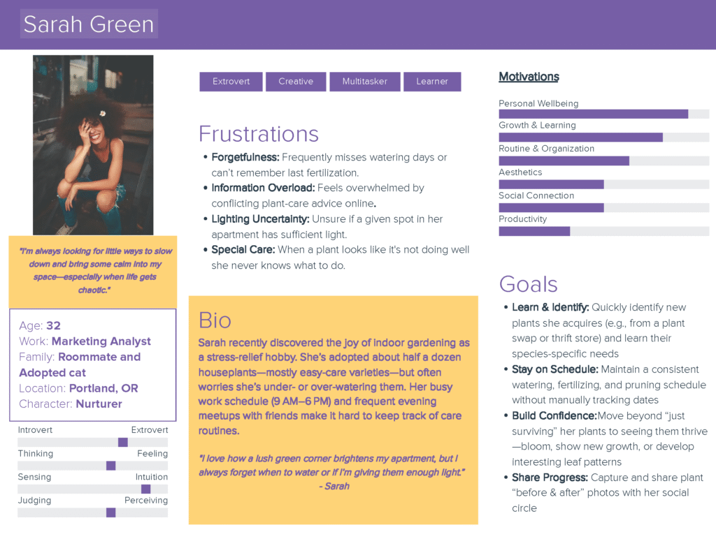
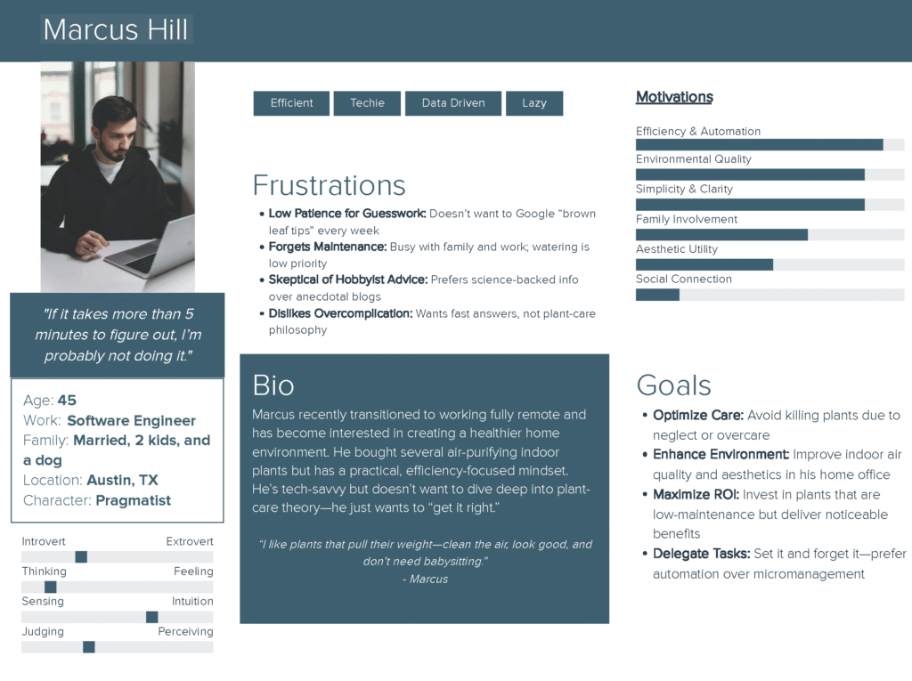
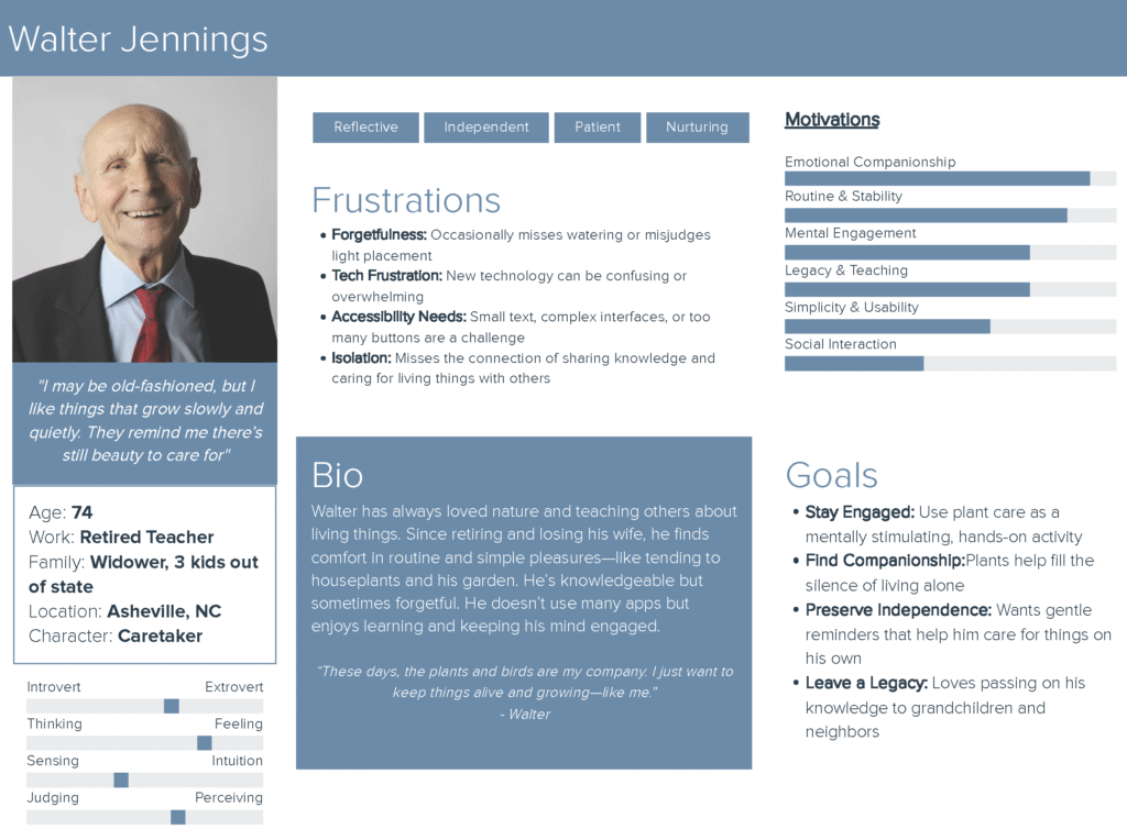
Personas
Creating these personas helped define the problem, address potential solutions through features, and hone the objective of the app itself. I created a survey that I sent out across social media channels and through personal invitation that helped to gather data regarding needed features and demographics that would be interested in this proposed service. Based on the data collected, I created these user personas to further clarify the features that the app should have as well as capture the broad demographic that this app would appeal to.
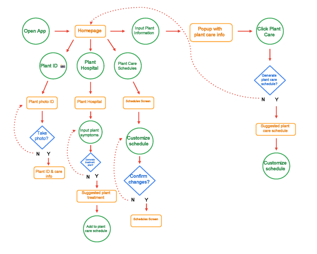
User Flow
This user flow was designed to prioritize simplicity, guidance, and flexibility for a wide range of plant owners—from beginners to experienced caretakers. It begins with a clear, intuitive homepage offering three main paths: identifying a plant, diagnosing plant issues, or managing care schedules. Each path was built to minimize user confusion by offering straightforward decision points and support, such as optional photo-based plant ID or symptom entry for treatment recommendations.
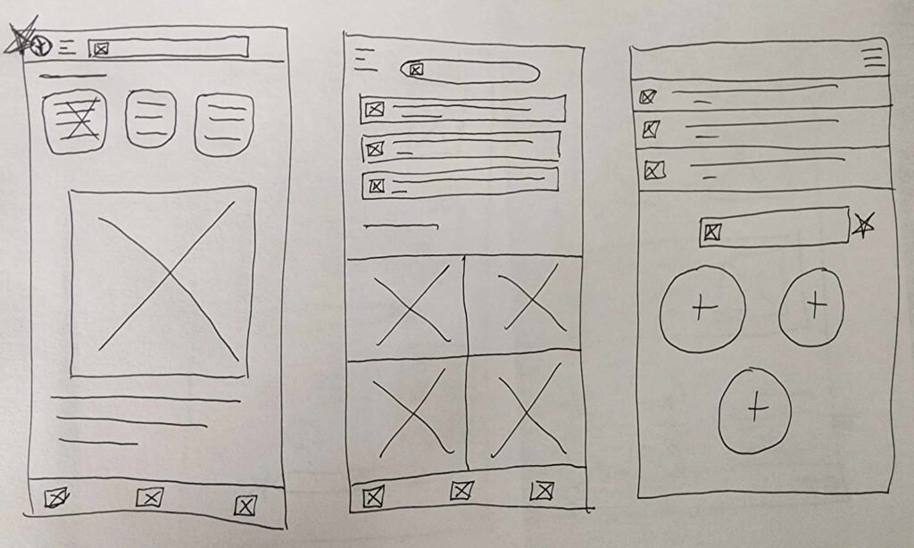
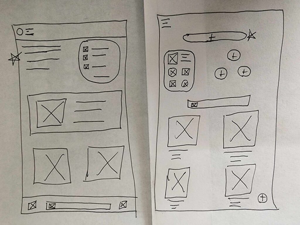
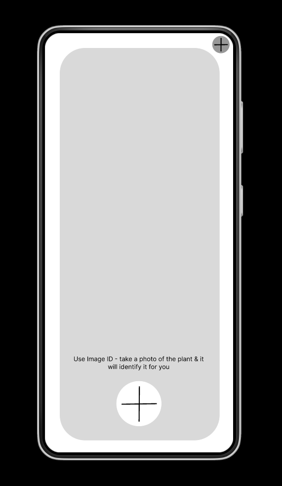
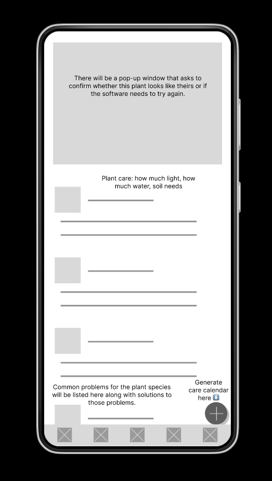
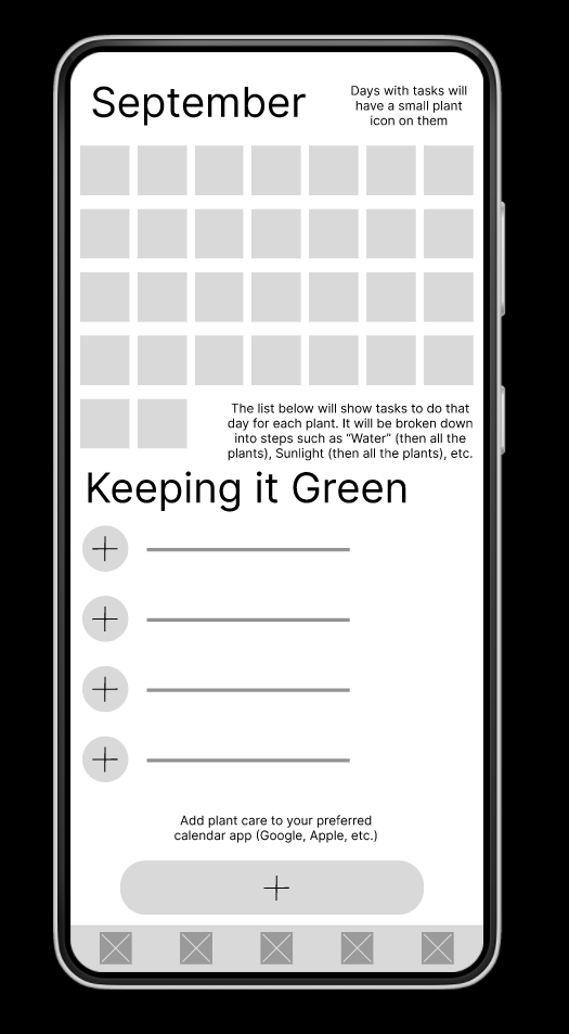
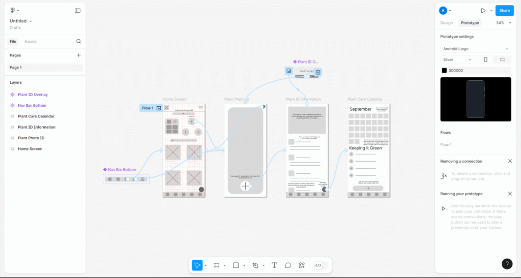
Wireframes
Starting with many iterations of hand-drawn wireframes, I selected some favorite features from each to start on creating digital wireframes. The user flow directly informed the features and placement of pages for this step, creating what I thought would be a clear and understandable user flow. Usability testing would prove otherwise, but revisions helped to create a solid final product.

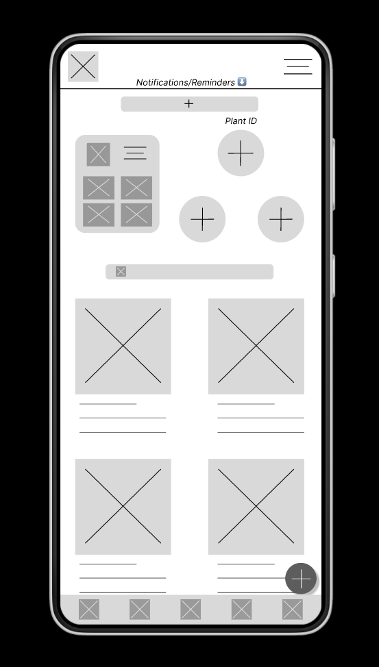
Revisions & WCAG
Several rounds of usability testing resulted in identifying many areas for improvement in the design. The original proved overly cluttered and unnecessarily complicated. Simplified designs directed users attention to points of interest, helping to guide the user flows. Designs were checked against the WCAG accessibility guidelines for contrast, animation speed, multiple points of access for features, and overall ease of use. I focused a lot of effort on meeting the WCAG 2.2 guidelines as best I could.

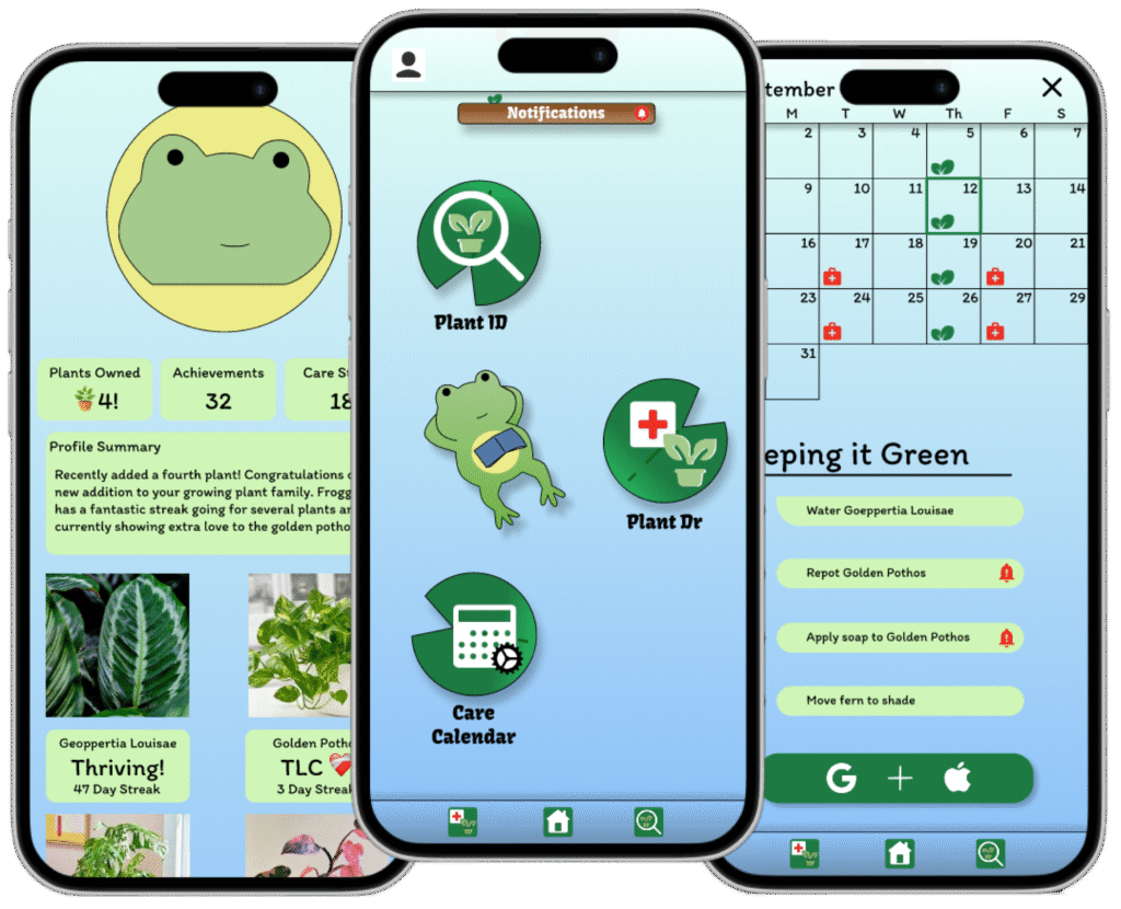
Final Design
Through many iterations and much testing I finally arrived at this design. I found that keeping the app simple was far more effective than trying to pack in every feature that users mentioned would be nice. Continuous user feedback would allow for further improvements to be designed and implemented. Future iterations may include some of the features that were removed in this first product.